 ASP.NET
CSS3线性渐变实现4圆环相连(代码实例)
1、掌握CSS3中线性渐变(linear-gradient)的实现方法
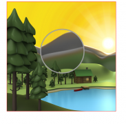
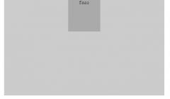
问题:要求实现以下效果,使用纯DIV+CSS,必须使用知识点 线性渐变(linear-gradient),且居中显示

附加说明:
1、一个彩色圆环的大小是400pxIT之家400px,里面空白圆环大小为260pxIT之家260px
2、右边圆环和左边圆环的左移距离为120px
3、下边圆环和上边圆环的上移距离为20px
思路分析:1、最外层是一个绿色边框的div,里面包裹着4个圆环
2、div分上下两部分,两部分其实都是一样的,只要实现了上面部分,下面部分其实是可以拷贝,只是margin-top要更改一下
3、每个圆环其实都是一样,只是位置不同,所以只要把一个渐变圆环实现出来,其他所有的圆环都可以复制第一个圆环
现在来具体操作
1、创建好index.html,写好架构
架构思路:
1、外层容器我们就叫做.container容器,里面分成.top,.bottom两部分,每个部分里面包含两个圆环div,
并行的两个div圆环,因为要水平排列,所以肯定需要float,既然float,了,在容器的最后需要加上一个.clear的div,清除浮动,这样可以让容器依然包裹住两个float的圆环div
2、每个圆环其实也是由两个部分组成,一个外层彩色圆环和内层一个白色的小的圆环
根据分析得出以下架构代码
<!DOCTYPE html> <html lang="en"> <head> <meta charset="UTF-8"> <meta name="viewport" content="width=device-width, initial-scale=1.0"> <title>渐变圆环</title> </head> <body> <div class="container"> <div class="top"> <!-- 第一个圆环 --> <div class="colorcircle circle1"> <div class="smallcircle"> </div> </div> <!-- 第二个圆环 --> <div class="colorcircle circle2"> <div class="smallcircle"> </div> </div> <div class="clear"> </div> </div> <div class="bottom"> <!-- 第一个圆环 --> <div class="colorcircle circle1"> <div class="smallcircle"> </div> </div> <!-- 第二个圆环 --> <div class="colorcircle circle2"> <div class="smallcircle"> </div> </div> <div class="clear"> </div> </div> </div> </body> </html>2、接下来,写样式
1、创建css文件夹,方便管理所有的css文件,创建index.css,里面的样式怎么写呢,思路如下:
1、.container IT之家
思路分析
1、为了设置容器里的所有元素的公共样式,我们可以将这些公共代码写入.container IT之家 样式内
所以index.css中添加代码如下:
.container IT之家{ padding:0; margin: 0; }2、外层彩色圆环.colorcircle
思路分析
1、根据要求得知,width:400px,height:400px,因为是圆形的,所以需要设置边框圆角为400px即border-radius: 400px;,
2、因为背景是七彩色的,所以需要用到线线渐变,而且颜色渐变从左到右依次是红橙黄绿青蓝紫,所以转成代码即background-image:linear-gradient(to left, red, orange,yellow,green,blue,indigo,violet);
3、然后用到了圆角,需要设置border,否则不会生效,但是它的边框是透明的,所以转成代码即border:1px solid transparent;
4、为了确保圆环并行排列,所以需要让它float:left
根据分析,继续在index.css中添加代码如下:
.colorcircle{ width:400px; height:400px; border-radius: 400px; background-image:linear-gradient(to left, red, orange,yellow,green,blue,indigo,violet); border:1px solid transparent; float: left; }3、圆环内层白色小圆环 .smallcircle
思路分析:
1、根据要求得知,width: 260px,height:260px,因为是圆形的,所以需要设置边框圆角为260px即border-radius: 260px;,背景白色background-color: white;
因为要居中,所以它的左间距,上间距为70px=(400-260)/2
2、然后用到了圆角,需要设置border,否则不会生效,但是它的边框是透明的,所以转成代码即border:1px solid transparent;
继续index.css中添加代码如下:
.smallcircle{ width: 260px; height: 260px; border-radius: 260px; background-color: white; margin:70px auto; border:1px solid transparent; }4、.clear样式
思路分析:
1、需要清除浮动,所以需要float:none,clear:both
2、这种div里面没有内容,为了不影响布局,需要设置width,height都为0
继续index.css中添加代码如下:
.clear{ clear: both; float: none; width: 0; height: 0; }5、右边圆环.circle2
思路分析:
1、根据要求得知,左移量为120px,所以margin-left:-120px
继续index.css中添加代码如下:
.circle2{ margin-left:-120px; }6、下面部分.bottom
思路分析:
1、根据要求得知,上移量为20px,所以margin-top:-20px
继续index.css中添加代码如下:
.bottom{ margin-top:-20px; }7、最外层.container
思路分析
1、因为整体要居中,所以转成代码即 margin:0 auto;因为是绿色边框所以 border:1px solid green;
2、div默认宽度是100%,为了让它居中,需要设置宽才可以,width=684px(400+400+4【圆环4个border】-120),高度=784(400+400+4【圆环4个border】-20)
继续index.css中添加代码如下:
.container{ border:1px solid green; width:684px; margin:0 auto; height: 784px; }到此为止,index.css所有内容如下:
.container IT之家{ padding:0; margin: 0; } .colorcircle{ width:400px; height:400px; border-radius: 400px; background-image:linear-gradient(to left, red, orange,yellow,green,blue,indigo,violet); border:1px solid transparent; float: left; } .smallcircle{ width: 260px; height: 260px; border-radius: 260px; background-color: white; margin:70px auto; border:1px solid transparent; } .clear{ clear: both; float: none; width: 0; height: 0; } .circle2{ margin-left:-120px; } .bottom{ margin-top:-20px; } .container{ border:1px solid green; width:684px; margin:0 auto; height: 784px; }然后将index.css引入index.html中
<!DOCTYPE html> <html lang="en"> <head> <meta charset="UTF-8"> <meta name="viewport" content="width=device-width, initial-scale=1.0"> <title>渐变圆环</title> <link rel="stylesheet" href=https://www.adminbuy.cn/"css/index.css" /> </head> <body> <div class="container"> <div class="top"> <!-- 第一个圆环 --> <div class="colorcircle circle1"> <div class="smallcircle"> </div> </div> <!-- 第二个圆环 --> <div class="colorcircle circle2"> <div class="smallcircle"> </div> </div> <div class="clear"> </div> </div> <div class="bottom"> <!-- 第一个圆环 --> <div class="colorcircle circle1"> <div class="smallcircle"> </div> </div> <!-- 第二个圆环 --> <div class="colorcircle circle2"> <div class="smallcircle"> </div> </div> <div class="clear"> </div> </div> </div> </body> </html>运行结果如下:

发现下面部分.bottom的margin-top好像失效了,其实如果我们将.bottom的border设置成红色,可以看出,其实也是上移了20px,但是因为里面圆环是float的,且默认的postion为relative,所以圆环是无法再上移的,怎么办呢?这里提供两种解决方案:
1、我们将.bottom的postion设置为absoute
index.css中.bottom代码修改如下:
.bottom{ margin-top:-20px; position: absolute; }我们再来运行效果:

我们发现效果实现了
还有一种方法就是
2、通过让.top,.bottom上下两个div都float:left,也可以解决,只不过这样在.container的最后需要添加.clear 块
index.html代码修改如下:
<!DOCTYPE html> <html lang="en"> <head> <meta charset="UTF-8"> <meta name="viewport" content="width=device-width, initial-scale=1.0"> <title>渐变圆环</title> <link rel="stylesheet" href=https://www.adminbuy.cn/"css/index.css" /> </head> <body> <div class="container"> <div class="top"> <!-- 第一个圆环 --> <div class="colorcircle circle1"> <div class="smallcircle"> </div> </div> <!-- 第二个圆环 --> <div class="colorcircle circle2"> <div class="smallcircle"> </div> </div> <div class="clear"> </div> </div> <div class="bottom"> <!-- 第一个圆环 --> <div class="colorcircle circle1"> <div class="smallcircle"> </div> </div> <!-- 第二个圆环 --> <div class="colorcircle circle2"> <div class="smallcircle"> </div> </div> <div class="clear"> </div> </div> <!--如果.top,.bottom都float了,需要加上此行--> <div class="clear"> </div> </div> </body> </html>index.css代码如下:
.container IT之家{ padding:0; margin: 0; } .colorcircle{ width:400px; height:400px; border-radius: 400px; background-image:linear-gradient(to left, red, orange,yellow,green,blue,indigo,violet); border:1px solid transparent; float: left; } .smallcircle{ width: 260px; height: 260px; border-radius: 260px; background-color: white; margin:70px auto; border:1px solid transparent; } .clear{ clear: both; float: none; width: 0; height: 0; } .circle2{ margin-left:-120px; } /IT之家 解决上移问题 IT之家/ .bottom{ margin-top:-20px; float: left; } .top{ float: left; } /IT之家 end IT之家/ .container{ border:1px solid green; width:684px; margin:0 auto; height: 784px; }运行结果为:

效果还是一样的
到此为止,我们就实现了全部的需求
总结:1、学习了CSS3中线线渐变的语法如
linear-gradient(to left, red, orange,yellow,green,blue,indigo,violet);
其中方向left也可以是right,后面的颜色,可以2个或者3个都可以自定义
希望本文能给大家带来一定的帮助,谢谢!!!
以上就是CSS3线性渐变实现4圆环相连(代码实例)的详细内容,更多请关注聚合云库其它相关文章!
本站内容来源于网络,如有侵权请与我们联系,我们会及时删除,我们深感抱歉!
注:本站所有信息仅供用于网络技术学习参考,学习中请遵循相关法律法规!
本文地址: https://v30.fanwenzhu.com/jiaob/cssm/8246.shtml
相关文章
热门TAG
win10 ecshop 主机 阿里云 解决 配置 C# C++ 解析 SQL语句 命令 Go语言 方法 CSS3 HTML5 CSS win7 MSSQL 服务器配置 IIS7.5 IIS7 IIS6 IIS CentOS 7 Linux oracle数据库 oracle phpcms discuz discuz教程最新文章
-
 其中border-left决定了底部直
时间:2021-01-23
-
 当你自己回头来看你写的
时间:2021-01-23
-
 ④格式标签 粗体:b/b 斜
时间:2021-01-23
-
 我们直接看代码: !DOCTY
时间:2021-01-23
-
 这里就是吐槽的IE6!) 图
时间:2021-01-23
-
 假设我们的HTML代码如下:
时间:2021-01-23
-
 那么使用 CSS3 新增的选择
时间:2021-01-23
-
 scaleGlassRectangle.y
时间:2021-01-23
热门文章
-
 可以加我的HTML5前端交流群111645711 CSS源码
时间:2021-01-15
-
 就可以对子元素进行 3D 变形操作了
时间:2021-01-12
-
 用css让一个容器水平垂直
时间:2021-01-12
-
 而没有设置高度
时间:2021-01-19
-
 canvas与html5实现视频截图成果
时间:2021-01-19
-
 所以通常不需要发送
时间:2021-01-19
-
 我们尝试一下更新一下HTML结构
时间:2021-01-23
-
scaleGlassRectangle.y
时间:2021-01-23
-
 HTML5生拖放实例分析
时间:2021-01-12
-
 在全局:root{ }伪类中定义了一个 CSS 变量
时间:2021-01-21