 ASP.NET
css3 如何实现进度条效果
这篇文章主要介绍了利用css3实现进度条效果及动态添加百分比,文中通过示例代码介绍的非常详细,对大家的学习或...

项目过程中,开始使用了js的requestAnimationFrame方法实现进度条,但是在数据超级多的时候非常影响性能,如此改用css去实现,优化。
先贴代码:
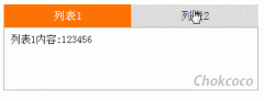
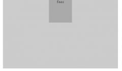
<!DOCTYPE html> <html lang="en"> <head> <meta charset="UTF-8"> <meta name="viewport" content="width=device-width, initial-scale=1.0"> <meta http-equiv="X-UA-Compatible" content="ie=edge"> <title>Document</title> <style type="text/css"> *{margin: 0;padding: 0} .box{width: 100px;height: 10px;border-radius: 10px;background: #999;margin: 100px auto;border: 1px solid #ff6780;} .child{position: relative;height:100%;border-radius:inherit;} .process-animate{background: #ff6780;position: absolute;left: 0;top: 0;bottom: 0;border-radius:inherit; animation: process 1s linear forwards ; } @keyframes process { 0%{ left:0;right:100%; } 20%{ right:80% } 40%{ right:60%; } 60%{right:40%;} 80%{right:20%;} 100%{right:0;} } </style> </head> <body> <p class="box"> <p class="child" style="width:50%"> // child的百分比就是进度条的占比效果 <p class="process-animate"></p> </p> </p> </body> </html>效果图(复制代码可查看动态效果):

正常情况下,百分比肯定是根据后台数据进行计算得出的,所以是动态传入的,下面贴vue代码
进度条子组件(progress.vue):
<template> <p class="process-wrapper" :class="{'addGray':addGray}"> <p class="process-child" ref="processChild"> <p class="process-animate" :class="{'addGray':addGray}"></p> </p> </p> </template> <script> export default { props: { addGray: { //置灰 type: Boolean, default: false }, progressWidth: { //进度条百分比 type: Number, default: 0 } }, mounted() { this.$nextTick(() => { console.log(this.addGray, "addGray---"); this.$refs.processChild.style.width = this.progressWidth + "%"; //动态改变进度条 // this.$refs.processChild.style.width = 90 + "%"; 测试效果 }); } }; </script> <style lang="scss" scoped> .process-wrapper { width: 1.98rem; height: 0.13rem; margin: 0.12rem 0 0.1rem 0; border-radius: 0.1rem; background: #fff; border: 0.01rem solid #ff6780; &.addGray { background: #999; border: 0.01rem solid #999; } .process-child { position: relative; height: 100%; // width: 100%; //这个width就是动态变化。通过js改变 border-radius: inherit; .process-animate { background: #ff6780; position: absolute; left: 0; top: 0; bottom: 0; border-radius: inherit; animation: process 1s linear forwards; &.addGray { background: #999 !important; // border: 0.01rem solid #999; } } } } @keyframes process { 0% { left: 0; right: 100%; } 20% { right: 80%; } 40% { right: 60%; } 60% { right: 40%; } 80% { right: 20%; } 100% { right: 0; } } </style>父组件调用:
<!-- 进度条 --> <Progress :addGray="inactive" :progressWidth="progressWidth"></Progress>看看实际效果:

推荐教程:《CSS教程》
本站内容来源于网络,如有侵权请与我们联系,我们会及时删除,我们深感抱歉!
注:本站所有信息仅供用于网络技术学习参考,学习中请遵循相关法律法规!
本文地址: https://v30.fanwenzhu.com/jiaob/cssm/7047.shtml
上一篇:css实现背景图片拉伸填充
相关文章
热门TAG
win10 ecshop 主机 阿里云 解决 配置 C# C++ 解析 SQL语句 命令 Go语言 方法 CSS3 HTML5 CSS win7 MSSQL 服务器配置 IIS7.5 IIS7 IIS6 IIS CentOS 7 Linux oracle数据库 oracle phpcms discuz discuz教程最新文章
-
 其中border-left决定了底部直
时间:2021-01-23
-
 当你自己回头来看你写的
时间:2021-01-23
-
 ④格式标签 粗体:b/b 斜
时间:2021-01-23
-
 我们直接看代码: !DOCTY
时间:2021-01-23
-
 这里就是吐槽的IE6!) 图
时间:2021-01-23
-
 假设我们的HTML代码如下:
时间:2021-01-23
-
 那么使用 CSS3 新增的选择
时间:2021-01-23
-
 scaleGlassRectangle.y
时间:2021-01-23
热门文章
-
 可以加我的HTML5前端交流群111645711 CSS源码
时间:2021-01-15
-
 就可以对子元素进行 3D 变形操作了
时间:2021-01-12
-
 用css让一个容器水平垂直
时间:2021-01-12
-
 而没有设置高度
时间:2021-01-19
-
 canvas与html5实现视频截图成果
时间:2021-01-19
-
 所以通常不需要发送
时间:2021-01-19
-
 我们尝试一下更新一下HTML结构
时间:2021-01-23
-
scaleGlassRectangle.y
时间:2021-01-23
-
 HTML5生拖放实例分析
时间:2021-01-12
-
 在全局:root{ }伪类中定义了一个 CSS 变量
时间:2021-01-21