 ASP.NET
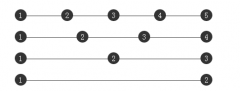
css中的五种常见页面布局
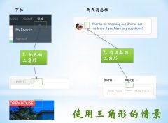
flex布局的优点,布局简单、灵活,移动端友好。absolute布局的有点是简单直接,兼容性好。float布局的兼容性比较好。...
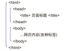
公共样式部分代码:
<!-- grid布局 --> <section class="layout grid"> <style> .layout.grid .left-center-right { display: grid; grid-template-columns: 300px auto 300px; } </style> <article class="left-center-right"> <div class="left"></div> <div class="center"> <h2>这是grid布局</h2> <p>这是一段文字</p> <p>这是一段文字</p> </div> <div class="right"></div> </article> </section>以上就是css中的五种常见页面布局的详细内容,更多请关注聚合云库其它相关文章!
(推荐教程:CSS教程)
<!-- flex布局 --> <section class="layout flex"> <style> .layout.flex { margin-top: 140px; } .layout.flex .left-center-right{ display: flex; } .layout.flex .center { flex: 1; } </style> <article class="left-center-right"> <div class="left"></div> <div class="center"> <h2>这是flex布局</h2> <p>这是一段文字</p> <p>这是一段文字</p> </div> <div class="right"></div> </article> </section>table布局

float布局
<!-- 浮动布局 --> <section class="layout float"> <style> .layout.float .left { float: left; } .layout.float .right { float: right; } </style> <article class="left-center-right"> <div class="left"></div> <div class="right"></div> <div class="center"> <h2>这是float布局</h2> <p>这是一段文字</p> <p>这是一段文字</p> </div> </article> </section>absolute布局
<!-- 定位布局 --> <section class="layout absolute"> <style> .layout.absolute .left-center-right > div { position: absolute; } .layout.absolute .left { left: 0; } .layout.absolute .center { left: 300px; right: 300px; } .layout.absolute .right { right: 0; } </style> <article class="left-center-right"> <div class="left"></div> <div class="center"> <h2>这是absolute布局</h2> <p>这是一段文字</p> <p>这是一段文字</p> </div> <div class="right"></div> </article> </section>flex布局
<!-- table布局 --> <section class="layout table"> <style> .layout.table .left-center-right { display: table; height: 100px; } .layout.table .left-center-right > div{ display: table-cell; } </style> <article class="left-center-right"> <div class="left"></div> <div class="center"> <h2>这是table布局</h2> <p>这是一段文字</p> <p>这是一段文字</p> </div> <div class="right"></div> </article> </section>grid布局
相关热词: CSS
本站内容来源于网络,如有侵权请与我们联系,我们会及时删除,我们深感抱歉!
注:本站所有信息仅供用于网络技术学习参考,学习中请遵循相关法律法规!
本文地址: https://v30.fanwenzhu.com/jiaob/cssm/5544.shtml
上一篇:css怎样实现DIV高度自适应
下一篇:利用css实现鼠标悬停效果
相关文章
热门TAG
win10 ecshop 主机 阿里云 解决 配置 C# C++ 解析 SQL语句 命令 Go语言 方法 CSS3 HTML5 CSS win7 MSSQL 服务器配置 IIS7.5 IIS7 IIS6 IIS CentOS 7 Linux oracle数据库 oracle phpcms discuz discuz教程最新文章
-
 其中border-left决定了底部直
时间:2021-01-23
-
 当你自己回头来看你写的
时间:2021-01-23
-
 ④格式标签 粗体:b/b 斜
时间:2021-01-23
-
 我们直接看代码: !DOCTY
时间:2021-01-23
-
 这里就是吐槽的IE6!) 图
时间:2021-01-23
-
 假设我们的HTML代码如下:
时间:2021-01-23
-
 那么使用 CSS3 新增的选择
时间:2021-01-23
-
 scaleGlassRectangle.y
时间:2021-01-23
热门文章
-
 可以加我的HTML5前端交流群111645711 CSS源码
时间:2021-01-15
-
 就可以对子元素进行 3D 变形操作了
时间:2021-01-12
-
 用css让一个容器水平垂直
时间:2021-01-12
-
 而没有设置高度
时间:2021-01-19
-
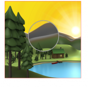
 canvas与html5实现视频截图成果
时间:2021-01-19
-
 所以通常不需要发送
时间:2021-01-19
-
 我们尝试一下更新一下HTML结构
时间:2021-01-23
-
scaleGlassRectangle.y
时间:2021-01-23
-
 HTML5生拖放实例分析
时间:2021-01-12
-
 在全局:root{ }伪类中定义了一个 CSS 变量
时间:2021-01-21